

Given that we are a company that develops advanced digital products, we need to keep up with trends in design to meet the needs of our existing and potential customers.
In this article, you’ll discover what is relevant in design now and what trends will drive this and the next few years.
But before we begin, let us remember how it all started many years ago.
Skeuomorph
For a long time, skeuomorph was a major trend in digital design. What is it? Here is what Wikipedia says:
“A skeuomorph is a physical ornament or design on an object made to resemble another material or technique.” — Wikipedia
In other words, it is an imitation of a surface or an object with another one.
The simplest example of skeuomorph are websites made from three to five years ago.
What could this be alluding to?
For example, in 2012 when a designer created site design for a company that sells trips to the Hawaiian Islands, as background he used photos of sea coast and palm trees with coconuts. Or as the background of online bookshop site images of shelves with books could be used. Such a cliché! At the time it was cool! These sites were on the map and made cash for their owners.

The main characteristics of this style:
- three-dimensional objects using literal images of things and objects;
- background with visual texture of natural materials: textile and leather, wood and metal;
- realistic buttons, badges, tumblers, stickers with intuitive features;
- natural colors peculiar to natural objects and materials;
- formatted text on the printed design principles, embossed lettering.
Were there any alternatives to skeuomorph?
In 2012 FLAT was designed to replace the trends losing their popularity. Its distinctive features:
- most simplicity, minimalism;
- absolute lack of any elements adding depth to images;
- supremacy of content in design;
- a small set of bright colors without gradients.
Do you recognize it?

To our delight, flat design continued its development. And in not so distant 2014 Google has presented the Android 5.0 mobile operating system for public inspection. It has opened the Material design to the world. Despite various predictions, it hasn’t lost its popularity till these days. Moreover, it has only gained momentum and now on a par with iOS X is a trendsetter in the mobile design and more.

Okay, enough with the long introduction! Let’s move on to the main subject! I will tell you what we will have to work with tomorrow, and at least for a year or two.
#1. Cinematography
The cinematography is not a regular GIF that we see on the Internet. Cinemagraph is still an image with minor elements moving on. This technique makes a simple photo more realistic by bringing it to life.
#2. Rapid deployment of Touch ID
When the sensory identification of a person has appeared, it was used only as a tool to unlock the mobile device. Yet, careful observers immediately dubbed this technology as the instrument of the future.
In 2015 Apple introduced Apple Pay to the world. It is a revolutionary mobile wallet. At once, it became obvious that its engineers are working on something more serious than a simple unblocking. Recently Apple announced that soon enough iOS will have a functionality allowing third-party applications such as Dropbox, Amazon, etc. use Touch ID access technology.
Not only a designer but also any person can experience the benefits of this approach. Conventional passwords that you need to remember and enter manually become a thing of the past. New online technology makes authentication easier and safer.
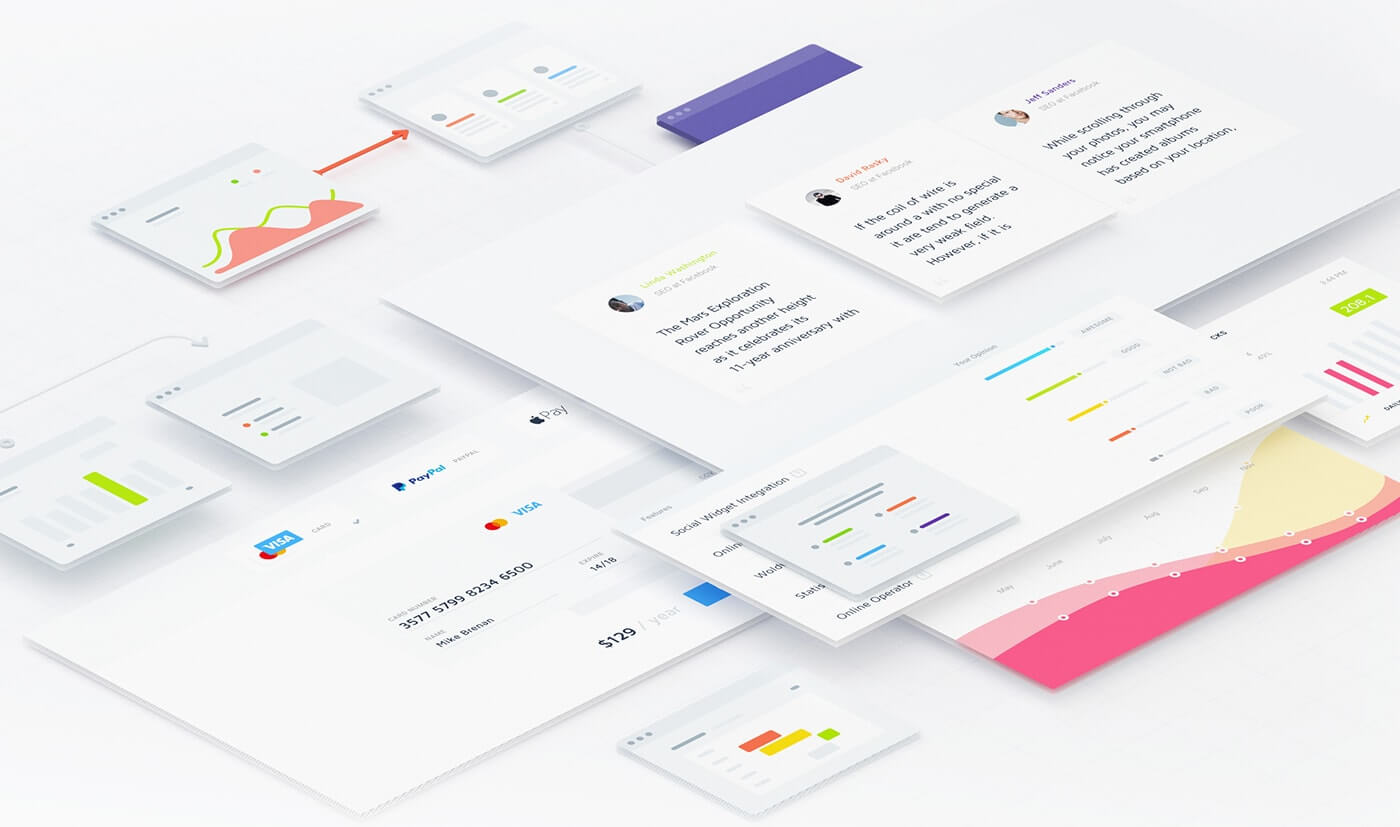
#3. Card Design
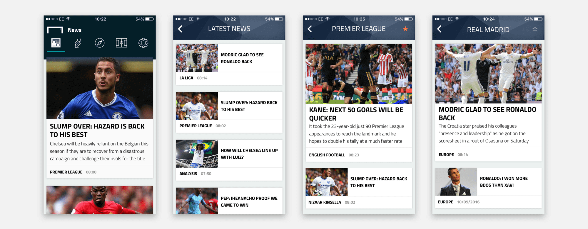

Cards or tiles have had a significant impact on web design. This approach allows you to show content in the most convenient way for mobile users.
No wonder tile piqued the app designers’ interest. A tile is an effective tool, especially because it allows you to break content into smaller pieces and then associate each item to the relevant content. Besides, cards enable users to choose their own actions.
Thus, the designer stays completely focused on user’s needs using this method of content delivery. If a mobile application is associated with a site it can attract more traffic. As cards make it very easy to run multimedia files, such as a video or an image from Twitter.
#4. Mobile = Responsive design
Perhaps it is the most important and binding trend to date. The website has to look equally well at all resolutions of monitors, laptops, screens of mobile smartphones and tablets.
By the way, search engines monitor how well the site is adapted to various devices. Based on that they define the place in the search results.
#5. Semi Flat design

Material design is a powerful trend in recent years. Accuracy and clarity are inherent to the websites executed in flat colors.
A new kind of flat design has appeared recently — Semi flat. It is when the whole design is made in flat color, and just one element has a shadow, gradient or texture. Generally, this element is a button, which is given dimensions or camber to attract the attention of visitors.
#6. Wearable mobile devices
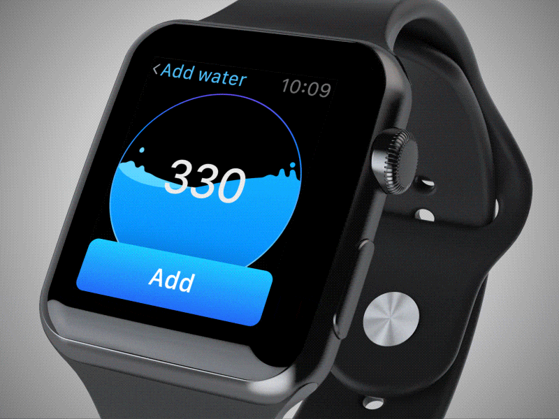
Perhaps it is too early to think about the design of wearable interfaces of mobile devices — this trend is only gaining momentum. But it will be revealed in the very near future.
Many experts have predicted a boom in sales of smartwatches, but this did not happen. However, this does not mean that wearable electronics has no chance of success.
It has, and it will, we just have to wait a bit!
So far, a tie of “smart clothes and smartwatch/smartphone display” works well enough. The mixed reactions of users to modern gadgets explain it. But as soon as the amount of technology reaches a critical mass, there will be a convenient way to interact with smart clothes.
That’s when new interfaces will be needed. What would they look like? It’s hard to say! As for now, all smart devices, including Apple Watch, use a time-tested approach. Users don’t really like it. So you need to monitor carefully what is going to happen in this area in the next year.
#7. Soft color palettes

The design is often the case where seemingly conflicting trends are equally relevant. The mobile app interface should be primarily functional, but the color palette may vary depending on the purpose of the application.
In some cases, the designer will choose a bright color palette and will be right. Because the bright color schemes are today’s trend. But he will also be right to slightly mute the color if he considers it necessary.
In 2017, the main trend is “less is better”. Therefore, designers should strive for simplicity, especially when working with color. Just look at the interface design of the most popular and stylish apps. And you will see that a minimalist approach was used in their design.

#8. Animation
Animations are increasingly present in web design, and they can be GIFs, SVG, WebGL, CSS or video.
Animations were definitely one of the biggest things in the web design trends of the last year, so do not hesitate!
#9. Non-standard grid

It is one of the latest web design trends that emerged as a result of the user getting used to the clear grid, the so-called split-layout. It was popular in 2016. Now the website grid more often becomes “broken”.
Today website page has no clear division into several columns: photos and text can be placed randomly, they may even overlap each other, thereby constituting an unusual composition.

A “broken” grid shapes new aesthetics. Users like new things. Even companies that are concerned about the corporate style can use this technique in a universal combination with the classical grid version.
#10. Avoiding the use of the hamburger menu
If you are working on digital products, then you read dozens of articles about the way Hamburger navigation on mobile devices (and desktops!) harms the UX metrics due to the low level of its detectability and efficiency.
Fortunately, a growing number of websites and applications are experimenting with alternative and more effective solutions to this problem.
Conclusion
None of the ideas described above is better than the others. Its viability and efficiency obviously depend on the content and context.
Turn to professionals to choose and create the most suitable design for you.
Or choose it yourself! Just be in trend!


