A logo is the key symbol of the brand in the consumer’s mind. It is very important to know how to design a logo. The designers’ main task when making a logo is to create a precise visual metaphor that would be consistent with the brand’s strategy and positioning. In this case, the accordance between the object (brand and product) and its symbol (logo) will allow building communication that would be extremely effective from the point of view of identification and memorization.
Effective Visual Communication
![]()
-
Understandable
The images and the symbols are understandable and easy to remember;
-
Relevant
The forms and images’ semantics correspond to the target audience values and to the context in which the service exists;
-
Consistent
A system of different formats and brand assets create a coherent and consistent image in the people’s minds;
-
Unique
The visual idea transmits attributes that are only indicative of this brand. It’s necessary to be aware of the fact that it’s not the logo that makes its owner famous. Vice versa, a high-demand product/work/service of the owner is what makes the logo famous.
Main Stages of Creating a Logo
- Data collection and analysis
- Concept
- Making corrections to the concept
- Implementation
1. Data collection and analysis
The first important stage in design is getting the initial data from the client. This helps to determine the project’s main task.
Before starting work we try to understand what the customer expects and what his goals are. We research the company (website), what it does, its particular features, and its position at the market, etc.
Research:
- Find competitive advantages;
- Determine the specific nature of the product/service;
- Determine the target audience of consumers/clients;
- Analyze the logos of similar firms that work in the same market segment;
- Based on these data determine the direction (color, style, etc.) for making the drafts
2. Concept
The logo can have any design, starting with a carefully drawn company mascot and ending with a graphic presentation of a couple of letters or a unique stroke (zigzag). Nevertheless, we are drawn towards simpler forms. They are easier to remember and more effective to deliver ideas.
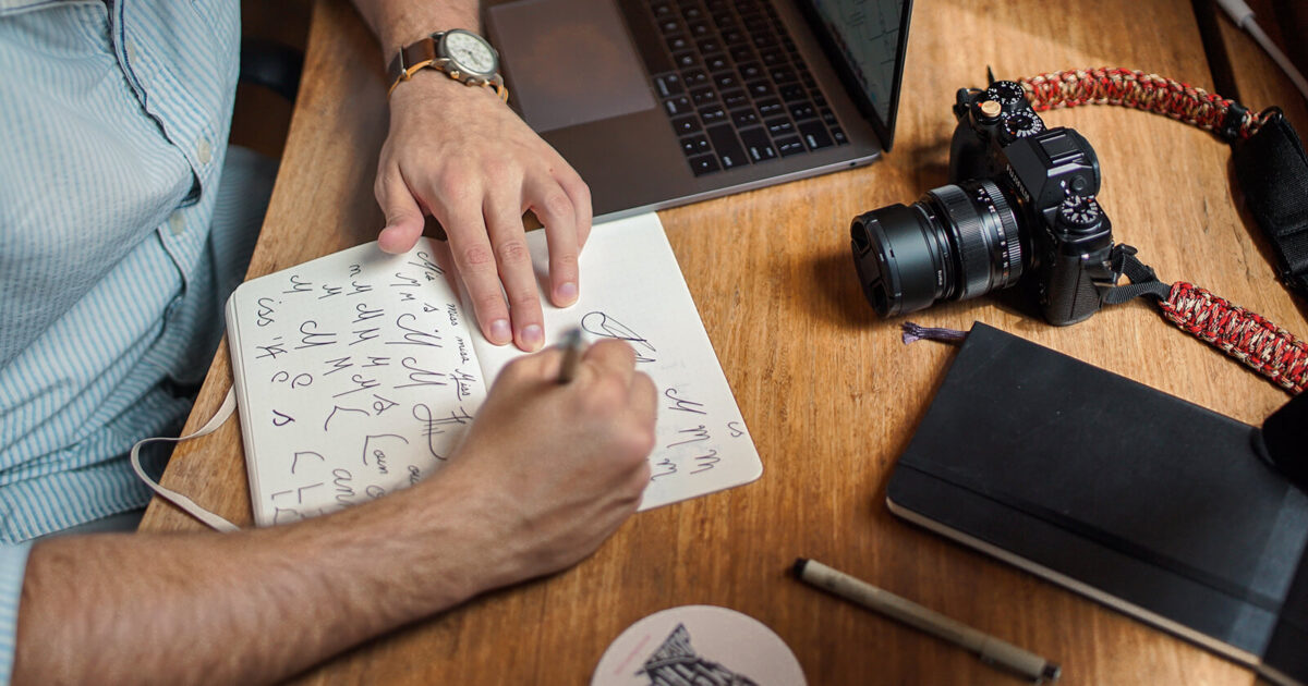
We pick the medium to determine the style. We find a solution for the colors, the fonts, or their elements. Make pencil sketches. No graphics editor is as good as a pencil sketch when it comes to a quick presentation of ideas. In many cases the sign should be presented in only one color for commercial or technological reasons, that’s why we start working at the sign from a black-and-white image.
We make sure that the logo is available in a vector. It should be easy to scale—that is, you should be able to scale it up as much as you want and it won’t lose its high quality.
3. Making corrections to the concept
At this stage, we check the logo drafts for:
- Corresponding to the special nature of the customer’s work;
- Key characteristics (memorability, functionality, etc.);
- Audience interaction: creating a positive associative flow, ease of comprehension, etc. This is done by polling a number of people from the target audience and potential customers and allows us to get some feedback;
4. Implementation
Presentation of the ready product.
The concept is good, but it’s better when this concept can be understood and delivered in different formats and production situations. We show how the logo can look in various mediums, the physical ones as well as the data ones.
Conclusion
Now you’ve seen the process of making a logo, the stages, and the features. It’s time to make it. You may use logo constructor or hire a freelancer. But are you sure that’s the way you want to do it? We can help you with this task, check our design works and make a good image of your startup.


