
The S-PRO company has grown immensely over the last couple of years and at some point, we’ve realized—the time has come! We needed a new visual identity that will emphasize our core values and best represent our vision. Now we are ready to share the story behind our identity.
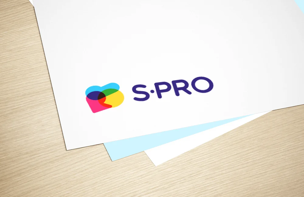
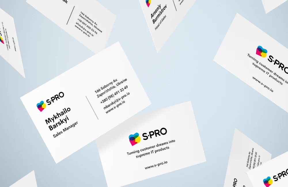
When we started developing, the main goal was to stand out visually among the general mass of IT companies. For this reason, bright colors were chosen – light blue close to turquoise, purple, and yellow. We use these 3 primary colors in our identity, by analogy with the CMYK color scheme, while in places where objects of different colors intersect – we get 4 more shades, without losing the integrity of the form.
Since all the letters in our name have very rounded shapes – we have chosen a font that will emphasize these shapes and not fight against it.
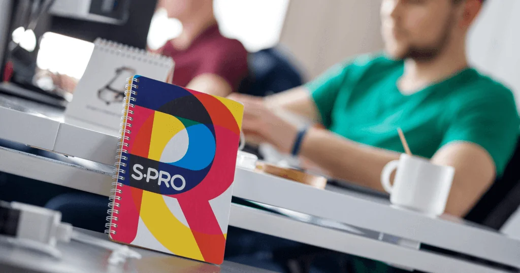
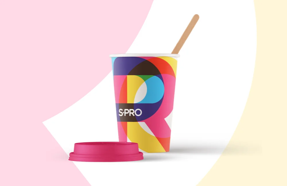
Our desire was to achieve the result when looking at a notebook, business card, badge, banner, or even t-shirt we can identify it as an element of our corporate identity without putting the brand name on it.
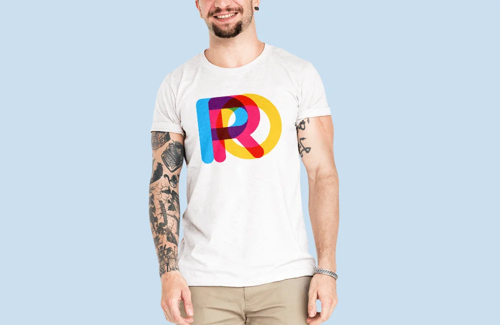
There is a simple specific branding pattern for our identity. It can be traced throughout all the elements presented. Using it, in fact, we are not limited in scale, and it can be any element – from the icon to the billboard.
Our identity is dynamic. Any identity is a system with certain rules and elements. In turn, a dynamic identity can change in a variety of ways. Elements can change their shape, color, location, but at the same time, the identity will perform its task – be recognizable.
Also, a dynamic identity allows uniting the most different of its carriers into one ecosystem. Starting from the icon – ending with a billboard. In the elements of our corporate identity, we used a certain pattern that can be easily traced throughout them. Using this pattern, we can look at a notebook, business card or other elements to identify it with our company.
More to that, identity is a way to communicate with a customer. It vividly demonstrates that people in our company are very bright, sometimes so much that they even contrast with each other, but during coordinated work and intersection, we form something gorgeous, like robots in the Chinese cartoons that fold into one big and powerful robot. The new corporate identity reveals our work in a new way and makes it clear for the customer that people with a high-quality and innovative approach to work are taking the task.
Conclusion
We believe that this identity will help us stand out against the general background of companies not only with a high-quality solution of business challenges but with a bright, pleasant appearance.
Market report

Subscribe


Thank you!
Get ready! You will receive handpicked content right to your inbox.